Between order and chaos
Consider a population of rabbits and foxes. The number of rabbits and the number of foxes will range between 0 and 1, representing the percentage of some theoretical maximum population. Each generation, the number of rabbits and foxes changes according to a simple rule.
The number of rabbits in generation , based on the number of rabbits and foxes in the previous generation , is given by:
The constant is the rabbits’ birth rate. For example, if , then each rabbit produces 2 offspring in the next generation. The factor accounts for deaths due to starvation and predation. If the number of rabbits is low, then few will die of starvation, if it’s high then many will; and likewise if the number of foxes is high, many rabbits will die from being eaten.
The number of foxes in the next generation is given by:
This says that the chance that a fox encounters and eats a rabbit is . So if the rabbit population is at 80% of its theoretical maximum, 80% of foxes will eat enough to reproduce, and will produce offspring.
So let’s pick some values for and and see how the system behaves. We’ll visualize it by plotting the populations on a graph. But instead of plotting both populations over time, we’ll plot the populations against each other. That is, we’ll leave time out of it and just plot the set of points over, say, 40,000 generations.
Let’s see what we get.
For most values of and , the system quickly finds a stable point. For and , it converges in on and . You can check that this is a fixed point of the recurrence.
Rabbits are on the -axis, foxes are on the -axis, and the origin is in the lower left-hand corner.
For other values of and , the system converges to a loop instead of a point.
Keep in mind the system is not necessarily going from one point to the next around the loop over time. It’s actually jumping between points that all happen to be on the same loop. Weird, huh?
At another point in the parameter space, the loop takes on an irregular shape.
Nearby, the loop breaks up into a set of smaller, weird loops…
… each of which proceeds to get weirder.
Then, everything gets weird.
This is beautiful if you ask me.
This is chaos (still beautiful).
Below, you can explore the parameter space yourself. Your mouse position determines the values of and .
Hold down shift for fine-tuning. (On mobile, drag your finger around the canvas.)
If you’re careful with your mouse, you can find places where the top-level loop divides into smaller loops, which divide again into still smaller loops, presumably ad infinitum. In fact, it seems like you can make the smaller loops exhibit all the same weird behavior the top-level loop does. So there is definitely some self-similar recursive structure here.
As you move your mouse around, doesn’t it feel like you’re looking at 2D slices of some larger, crazy complicated 4D object? I thought so too.
Here is the 3D slice you get when you fix (not recommended on mobile). Click and drag to rotate, scroll to zoom. You can also edit the url parameter to try different values for .
A map of the territory
Playing around with this, it seems like there are regions where the system converges to several points, other regions where it’s a loop, and other regions where it’s more like a cloud. Trying to find “interesting” regions of the parameter space can feel like wandering around without a map. So, let’s make a map.
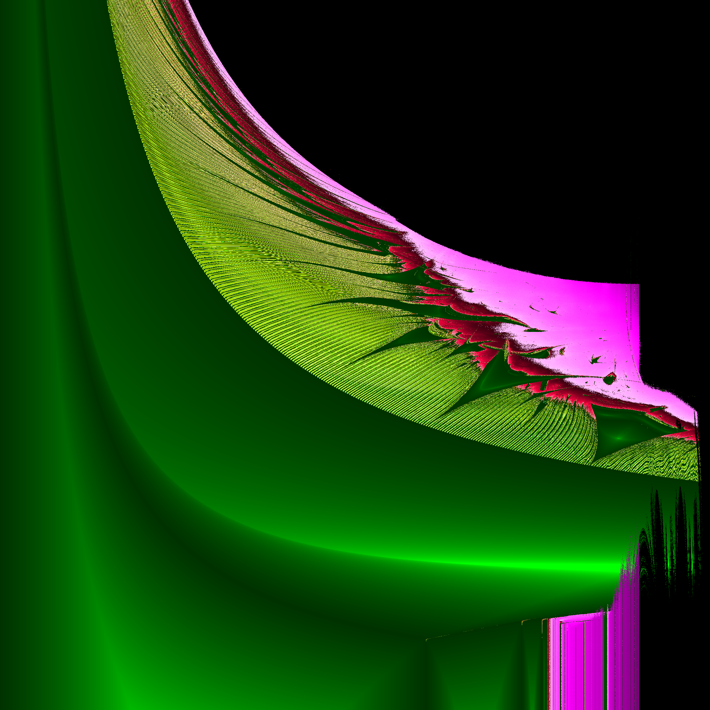
I’ll color each point according to how the system behaves with those parameter values. To do that I’ll use something called the Lyapunov exponent. This is a measure of how quickly two points and , initially spaced very close together, diverge or converge after repeated iteration. It’s assumed that the distance between them will go like , where is the iteration number. If , they stay the same distance apart. If , they get closer together over time, and if , they diverge. Larger exponents mean they diverge (or converge) faster.
I chose shades of green for , yellow for , red for , and purple for . If the system diverged to infinity (that is, gets very large), I colored the point black.
The image below is the what I got for between 1 and 4.333 and between 1 and 6.
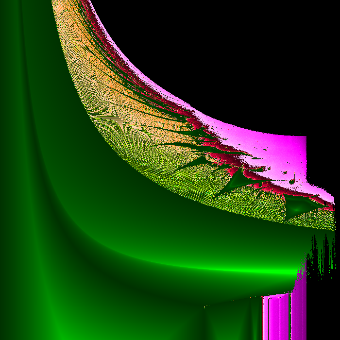
So, that’s a thing. Here it is as a 2400 x 2400 png. There is some definite fractal structure here. You can see this better in the higher resolution image, but the moiré pattern in the yellow/green region indicates long thin lines of alternating color. Between the big green triangles there are smaller triangles, and the bottom-left corners of these triangles extend all the way to the boundary.
But anyway, laying this map underneath the interactive plot from above, you can see how different regions of the parameter space behave. (Works on mobile too.)
What is this?
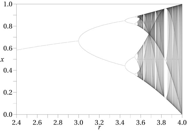
I don’t know, but it’s closely related to the logistic map, which is a similar recurrence given by:
This would model a population of rabbits subject only to starvation (no foxes). It’s pretty crazy too:
By Jordan Pierce - Own work, CC0, https://commons.wikimedia.org/w/index.php?curid=16445229
This must be the logistic map’s crazy 4D cousin. In fact, the vertical bars on the bottom right of the map match up precisely the the bifurcation points of the logistic map. The first split is at ( on my plot), the next is at 3.4, the next at 3.54, and then chaos takes over at 3.55, with breaks of order at 3.62, 3.72 and 3.81.
You can also find the ghost of the logistic map itself if you move your mouse around the small purple triangular region near the vertical bars around . Spooky!
So what?
There really is no so what. It’s just astonishing to me how much complex behavior can arise from two pretty simple rules.
blog comments powered by Disqus